Elevate Your Brand with the Power of Pantone Colours
When it comes to branding, colour is one of the most important elements. It can evoke emotions, convey messages, and make a strong first impression. That’s why many businesses turn to Pantone, a colour matching system that provides accurate and consistent colours across different mediums.
Pantone is a company that specialises in colour communication and provides a universal language of colour that enables accurate colour matching across different mediums. The Pantone Matching System (PMS) is the most widely used colour matching system in the world and is used by designers, printers, and manufacturers to ensure consistent colours.
In branding, consistency is key, and Pantone colours can help achieve that. By using Pantone colours in your branding, you can ensure that your colours are consistent across all mediums, from your website to your business cards to your packaging. This consistency helps to establish a strong brand identity and makes your brand instantly recognisable.
How does the Pantone Matching System (PMS) work?
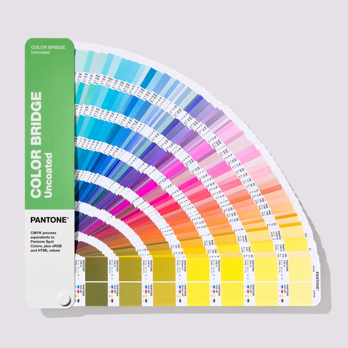 The Pantone Matching System (PMS) is a standardised colour matching system that uses a numbering system to identify colours. Each Pantone colour has a unique number that represents the specific colour. This system ensures that colours are consistent across different mediums and can be reproduced accurately.
PMS colours are created by mixing specific amounts of primary colours (cyan, magenta, yellow, and black) to create a specific shade. These colours are then printed using Pantone inks, which are specially formulated to ensure consistency and accuracy.
Understanding the Psychology of Colour and its impact on Branding
Colour psychology is the study of how colours affect human behaviour and emotions. Different colours can evoke different emotions and convey different messages. For example, blue is often associated with trust and professionalism, while red is associated with passion and energy.
When it comes to branding, it’s important to choose colours that align with your brand values and messaging. For example, a health and wellness brand might use green to convey a sense of health and nature, while a luxury brand might use gold to convey a sense of exclusivity and sophistication.
How Pantone Colours can Enhance your Brand Identity
By using Pantone colours in your branding, you can ensure consistency and accuracy across all mediums. This consistency helps to establish a strong brand identity and makes your brand instantly recognisable.
Pantone colours can also help to convey your brand’s message and values. By choosing colours that align with your brand messaging, you can create a strong emotional connection with your audience. For example, a brand that values creativity and innovation might use vibrant, bold colours to convey a sense of energy and excitement.
Many popular brands use Pantone colours in their branding to create a strong and consistent brand identity. Here are a few examples:
- McDonalds uses Pantone 123 C (yellow) as its primary colour, which has become synonymous with the brand.
- Tiffany & Co. uses Pantone 1837 C (blue) as its signature colour, which represents the year the company was founded.
- Cadbury uses Pantone 2685 C (purple), in all of its branding, merchandise and advertising, and can be easily identified.
When it comes to branding, colour is one of the most important elements.
Companies use Pantone Matching System (PMS) for their logos and advertising to synchronise their brands and to ensure they are consistent across the board.

How can you make the most of your new brand colours?
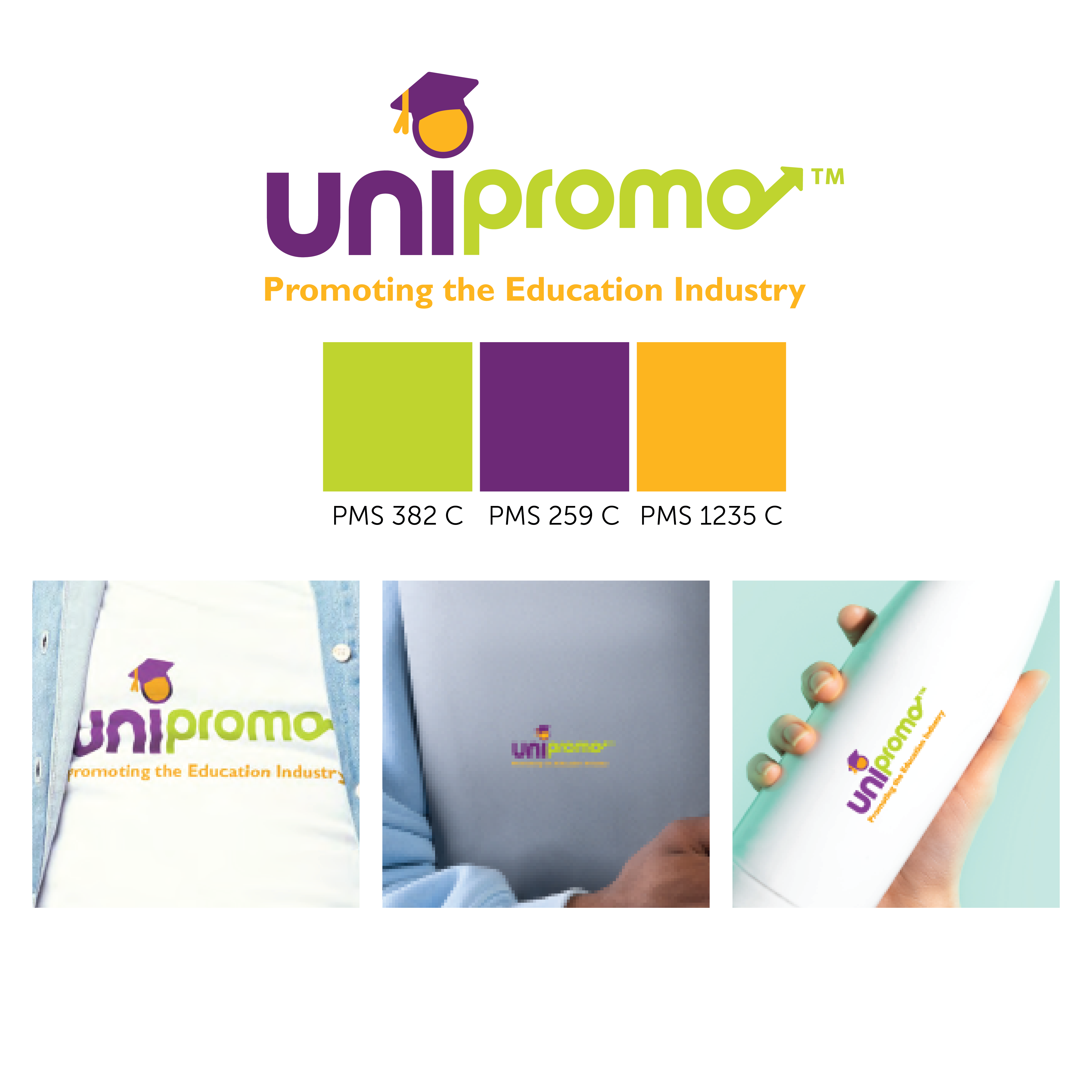
If you don’t already have a brand guide, what are you waiting for? If you’re unfamiliar, a brand guide is a collection of your logos and brand colours. This makes your brand accessible, recognisable, and replicable. Once you’ve selected your PANTONE shades, add them to your logos and your brand guide to create a consistent and professional representation of your brand.
Our team of branding specialists communicate using pantone colours daily and understand the importance of getting it right. Many of the promotional products we produce are custom made to match your specific pantone colours.
Ask us how we can do this to elevate your brand today!